Confident Patient Decision Making
OHSU SAME DAY HEALTHCARE

GETTING PATIENTS TO THE RIGHT CARE OPTION, FAST
For decades, Oregon's only academic medical center was known for specialty care and serving the sickest patients. Their various urgent care offerings were confusing to navigate and patients couldn’t tell the difference between them. There were brand new digital care services ready to serve all Oregonians, but they were little known and strewn throughout the website.

MORE VIRTUAL
The business wanted more virtual visits to combat the consistently full ERs and Urgent Care clinics. Patients wanted to be seen sooner, and more conveniently. It was clear - virtual health care needed to be more prominent.
Internal stakeholders wants to showcase a virtual journey and an in-person journey. Competitor healthcare websites were organizing their services in that way. Was that the right way to approach it?
PATIENT RECRUITMENT
I managed a database of potential participants cultivated via an online demographic screener through targeted, paid ads and social media posts, as well as selecting from OHSU’s existing patients. I reached out over email and snail mail, and scheduled participants across ages and insurance types, offering a small incentive for their time.
ETHNOGRAPHIC INTERVIEWS
It was important to understand the mindset of someone needing to be cared for immediately. When was the last time they needed Urgent Care? How did they decide where to go? How did they feel? How could they be better supported in this stressful time of decision making? I quickly learned most important factors, across persona types, were:
Urgency - how dire was the situation
Expediency - how quickly could they be seen
Cost - will insurance cover this
Notably, none of the important factors to patients included the modality (in person or virtual), whereas that was of the utmost importance to the business.
USER FLOW
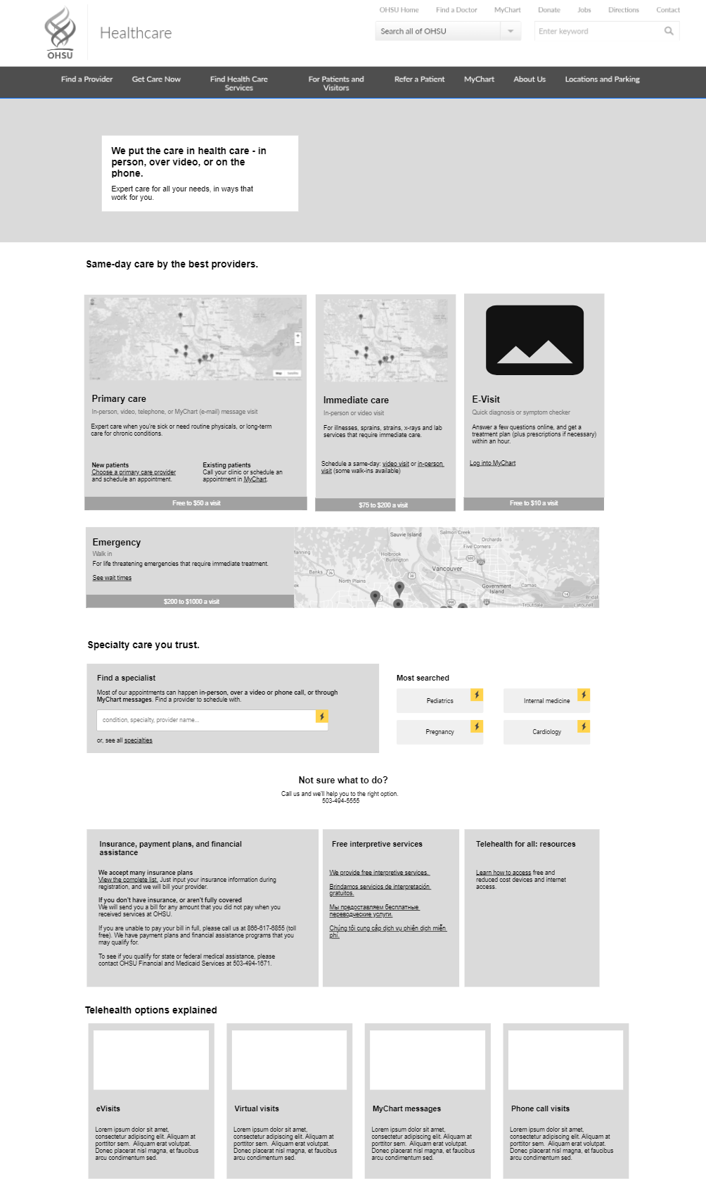
Rather than fit all the information about the various services on one page educate patients, I focused on what patients said in the interviews - when I’m stressed out, show less. I began with a routing page based on their top decision-making factors to help folks narrow down their choices.
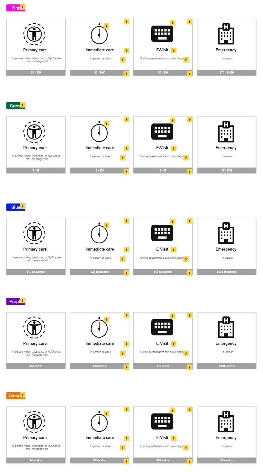
MOCKUPS
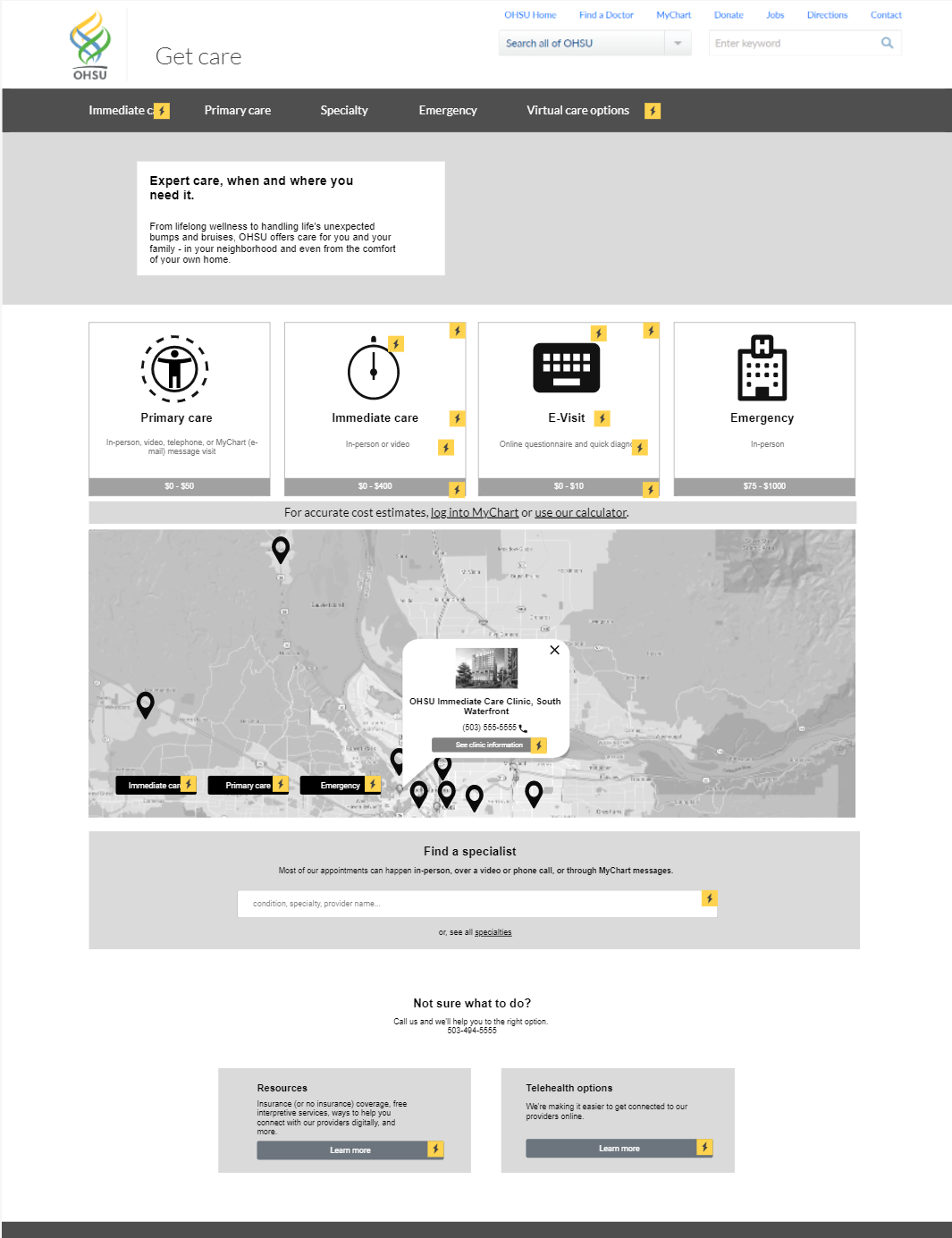
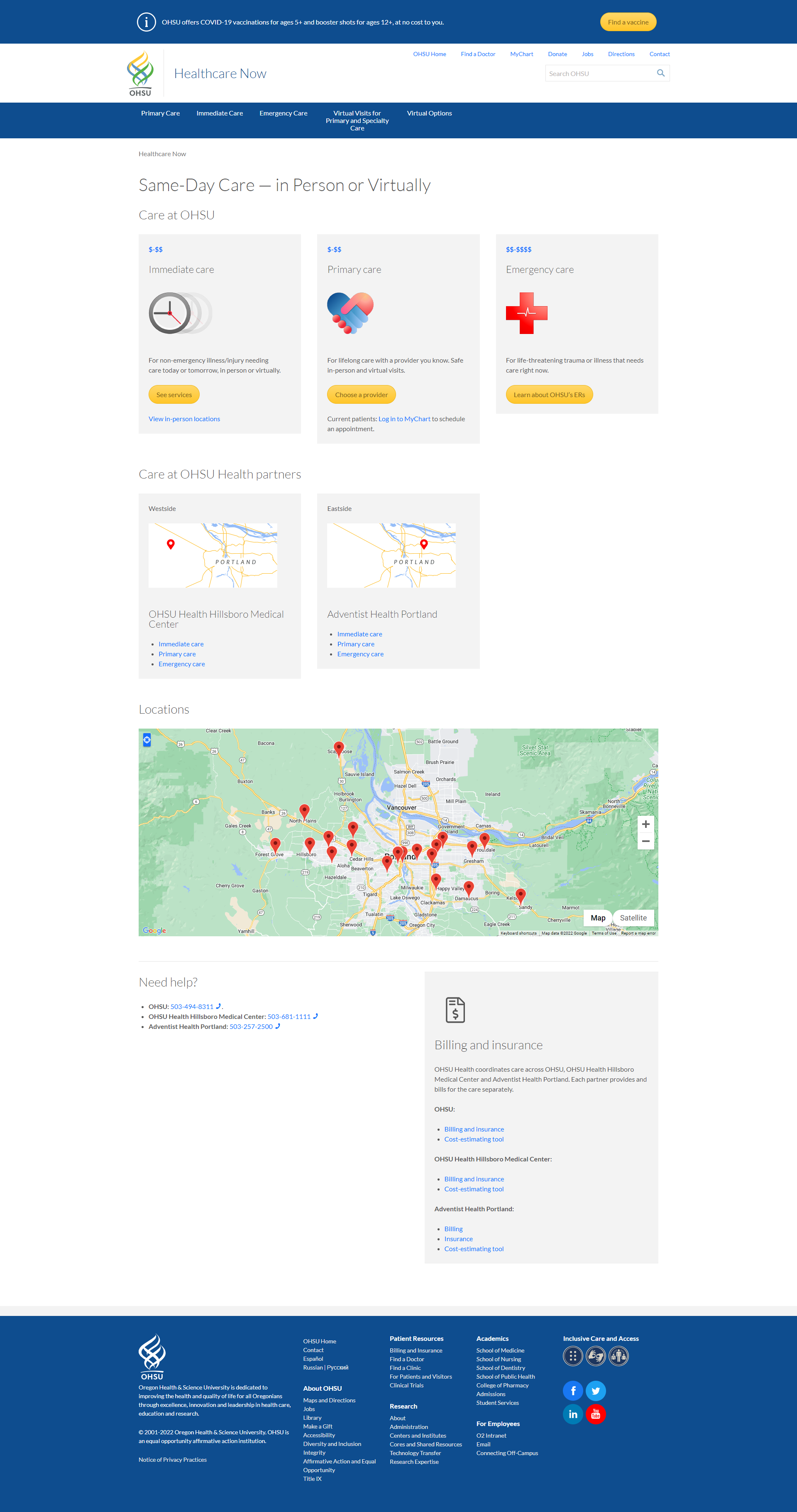
I created wireframes with real content to illustrate the proposed journey with stakeholders. From a search engine, patients would arrive at a simple “healthcare now” parent page, narrow down to the “acuity level” needed, then see differences between care options within that level of care.
USER TESTING
I created a script of scenarios based on the common use cases I gleaned from the original interviews, asked participants to imagine themselves in each, and gave tasks to complete by interacting with my clickable wireframes. At the end of the testing, I asked NPS, CSAT, modified SUPR-Q, and SEQ questions.
Better. But not quite there, yet.
After the initial round of prototype user testing, I knew we were on the right path. We had all the right information that patients needed, but it was still too much, all at once, when stakes (one’s own health) and emotions were high.
ROUND TWO OF WIREFRAMING
The first set of wireframes confirmed cost, acuity, expediency, and logistical convenience were decision making factors. And, the way they were displayed helped patients make decisions, quicker. But, I was happy to find a few learnings from the early testing.
MOBILE
For some pages, mobile breakpoints were more challenging for wayfinding and comprehension. It was easy to get disoriented.
CONTENT
The information we had was all largely appreciated, but tweaking when information was surfaced was crucial. We needed to display the bare minimum to help patients to the next step. Otherwise, they hesitated before narrowing down to the care options and moving closer to setting that all-important appointment with confidence.
MUST-KEEPS
A few things were important to preserve:
The usage of iconography for wayfinding was extremely helpful in reducing cognitive load. Less reading, more skimming.
The interactive Google Maps integration was helpful for those that use public transit and new patients unfamiliar with the location names.
Dollar signs as cost estimates were helpful, but patients wanted the ability to dive into more specificity - such as a cost estimator tool.
ONE LAST ROUND OF TESTING
After one more round of user testing and interviews, I was confident we had arrived at a useful and usable set of pages to help patients quickly and confidently navigate the various healthcare options available, and select the right one for them.
We saw better SEQ scores, and qualitatively, the patients hesitated less and were more at ease when completing the task-based scenarios.
CONCLUSION
To ensure the site pages were performing well post-launch, I analyzed real user engagement through web analytics and continued to propose and make slight improvements and adjustments quarterly. After a few months, OHSU’s Vice President of Ambulatory Care was pleased we had hit our user experience goals and remarked:
In supporting ambulatory goals, we uncovered how patients think about same-day healthcare, creating an experience on OHSU.edu that both educates patients about our new services and facilitates faster decision making.
The greatest learning from this project was that although the information that needs to be included may already be present, realigning the experience with how the end user naturally thinks is extremely valuable - even at the cost of extra clicks due to a reduction of content that is surfaced at once.